
Is there a difference between a mobile website and responsive design?
Our customers always ask us, “what’s the difference if I decide to have a mobile website instead of a responsive design,” Hopefully, this article will explain the significant variations between these two different types of website solutions.
There are significant differences between a mobile and responsive website respectively.
With the whole world now going seriously mobile the need to have a compatible mobile browser safe site is becoming of paramount importance. Not only to attract people to your brand but also to deliver quick and simple touch screen-activated functionality to the end-user. The speed of the page that loads on your mobile device and the rapid progression through pages make mobile websites & responsive design a definite plus for all online businesses.
Both options are a viable solution to getting your website optimized for mobile and tablet technology, however, opting for a mobile site usually costs a lot more than opting for a responsive website.
Are you looking for a mobile or responsive business web solution?
We offer affordable solutions for small & medium sized companies.Let's start with explaining about Mobile Website characteristics
Mobile sites are designed and developed differently from responsive sites.
Mobile sites are designed and developed entirely different from the start. Usually beginning with a sitemap, pages get created so that when an end-user navigates through pages, there is a structure that will lead from one page to another. A mobile site has a purpose that needs to be thoroughly worked out before beginning design and development.
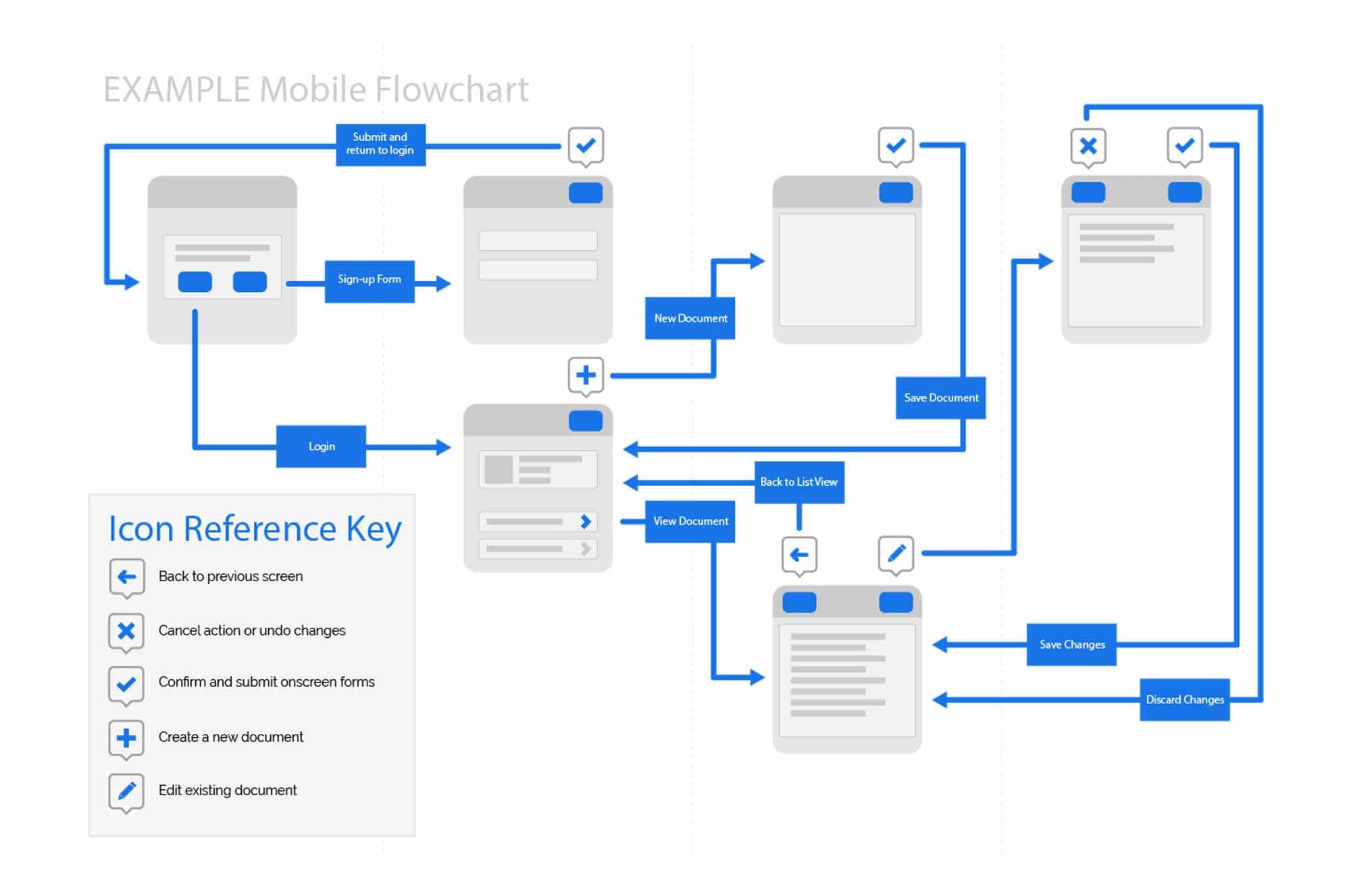
The Mobile user-interface appears differently on screen than responsive design
A mobile site displays on a mobile screen is similar to a responsive layout. Mobile websites are way more functional than their responsive counterparts, and each page is specially designed so that the mobile site looks much more professional. As stated earlier in this article, each page on a mobile website will have a unique design, and that is the same for the functions you find yourself clicking and interacting with when using it.
A mobile website page will have the look and feel of a mobile application. Information will be minimal and the functional aspect of the total page will look completely different and will co-ordinate with the other technical features of the page.
A mobile website does not eliminate the need to have a desktop website!
Just because you have a mobile site does not mean that this is the only website you will need. Yes, most people are using mobiles and tablets to access the internet, but the laptop and desktop PC users of this world still need to be able to view a website on their monitors. This is why having a mobile site can be costly. Not only will you still need a traditional desktop site, but you will also need a tablet website. Have you thought of the management? Will you do the changes via FTP (File Transfer Protocol), or will you use a CMS (Content Management System)? Will your websites be managed separately, or will content update simultaneously?
It also depends on what your intentions are for the project in question. Would you choose a mobile website for a regular 5-page brochure site? No, not really, because brochure websites are typically informative pages describing location, services and contact details but would be a perfect choice for a responsive website.
Take a look at some designed mobile interface screens below:
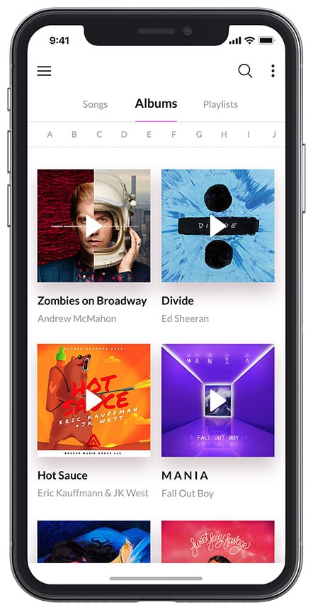
Playlist Screen

Calendar Screen

Gallery Screen
Mobile website facts:
Responsive Design Characteristics
While mobile sites have been designed specifically for mobile phone devices; responsive website design is for every device that includes mobile phones, tablets, PC desktops and any monitor of any size.
Usually, responsive sites are coded on a grid layout, so when viewed on a large screen will show the total size of a typical desktop-based website. When the size of the display reduces in width to a tablet device in landscape format, the device detects code in the website’s structure. It resizes the dimensions accordingly, showing the same content you viewed on the desktop monitor. Holding the tablet in a vertical position will shift the content according to the dimensions of the screen width. When using a mobile device, the website will change again down to a one grid column width, and all the website content will appear in a single line allowing for swiping the screen in a downward gesture.
These styles of design are coded to resize and fit the width dimensions of the screen.
Example of responsive grid layout below

Responsive website facts:
Cost usually has a large part to play in deciding which solution would be the right choice!
Both options are viable solutions to optimising your website for mobile and tablet technology; however, opting for a mobile site usually costs much more than opting for a responsive website.
Mediatopia can help your business create the right solution
Now that you have read this article, you might understand a little better what the differences are. Deciding on the right solution for your business website can be daunting, and knowing whom to ask or which web company will be the best choice will undoubtedly cause some headaches.
At Mediatopia, we have been creating responsive websites since 2011 as we always have our finger on the pulse of the latest and best technology. Today we are still creating responsive websites, but we have perfected the look and feel so that each site represents the needs and services of your business and that they look and work great on all modern tablets and mobile devices.