Introduction
Choosing the right colours can make all the difference when designing a website. Colours can evoke emotions and influence our behaviour, so understanding colour psychology is essential for creating an effective website. From branding to user experience, your chosen colours can impact every aspect of your website. So if you’re wondering, “Which colours should I use for my website?” then keep reading! In this blog post, we’ll explore how different colours affect us and provide tips on selecting the perfect palette for your site. Get ready to create a visually stunning and emotionally resonant online presence!
Use the quick links below to view answers
1. The Psychology of Colour
2. What are the Different Colours and Their Meanings?
3. Colours and Branding
4. Are Colour Palette Generators Good or Bad?
5. The User Experience
6. Best Colour Combinations For Websites
7. Best Background Colour For Website
8. What Colors Should I Use For My Website?
9. Conclusion

The Psychology of Colour
The psychology of colour is a fascinating area of study that explores the impact different colours have on human emotions and behaviour. Colours can evoke strong feelings, associations and memories, which affect how people perceive brands, products or websites.
Red is often associated with passion, urgency and excitement, while blue conveys trustworthiness, reliability and calmness. Yellow evokes happiness and optimism, while green symbolizes growth, nature and health. Purple represents luxury, creativity and spirituality, while orange communicates energy, warmth and enthusiasm.
However, cultural differences also play an important role in colour perception. For example, white is associated with purity in Western cultures but signifies mourning in some parts of Asia. Businesses must consider their target audience when selecting branding or website design colours.
It’s also worth noting that colour combinations can affect mood differently than individual colours alone. Complementary colours such as red/green or blue/orange create visual contrast that can be pleasing to the eye. In contrast, analogous colours like yellow/orange/red are more harmonious but less attention-grabbing.
In conclusion (just kidding!), understanding the psychological effects of different colours should be noticed by marketers when creating a brand image or designing a website for optimal user experience.

What are the Different Colours and Their Meanings?
Colours can evoke emotions, convey messages and create a visual impact. Each colour has its unique meaning and can influence how people perceive your brand. Here are some of the most common colours used in website design and their meanings:
Red: Red is often associated with passion, excitement, energy and urgency. It’s commonly used in call-to-action buttons or websites that want to grab visitors’ attention.
Blue: Blue is known for its calming effect and is often associated with trustworthiness, security and professionalism. It’s commonly used by financial institutions, healthcare providers or businesses that want to establish credibility.
Yellow: Yellow symbolizes happiness, optimism and friendliness. It’s often used by brands targeting younger audiences or those promoting fun experiences.
Green: Green represents growth, nature and health. It’s popular among environmental organizations or those selling natural products.
Purple: Purple signifies luxury, creativity and spirituality. Brands seeking a high-end image may incorporate purple into their branding.
Black/White/Grey: These neutral colours represent simplicity, sophistication and timelessness but can be dull if overused.
Understanding the meanings behind different colours can help you choose the right ones for your website based on your brand’s personality traits while keeping in mind your target audience.

Colours & Branding
Colours and branding go hand in hand. When you think of popular brands like Coca-Cola or McDonald’s, their colours immediately come to mind. Red and yellow, respectively, are associated with these brands, whether they be the logo or packaging.
This is because colours can evoke emotions and convey a message about a brand without even using words. For example, blue is often associated with trustworthiness and professionalism, so many financial institutions use it in their branding.
But choosing the right colours for your brand requires careful consideration as different cultures may interpret them differently. This means that what works well in one country could have negative connotations elsewhere.
It’s also important to consider colour combinations as they can impact how people perceive your brand. Complementary colours like blue and orange can create a sense of energy, while monochromatic schemes using shades of the same colour can create a more sophisticated look.
Selecting the right colours for your brand should be taken seriously, as they play an integral role in shaping how people view your business. Consider cultural differences and emotions evoked by certain hues and colour combinations when creating your visual identity.

Are Colour Palette Generators Good or Bad?
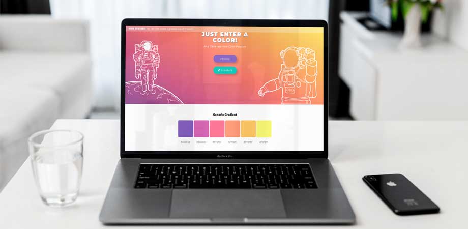
Colour palette generators are online tools that generate a set of colours for your website design. They can be accommodating in choosing a suitable colour scheme for your brand but also have limitations.
One advantage of using a colour palette generator is that it can save you time and effort in selecting colours that work well together. It’s easy to get stuck trying to find the perfect combination. Still, you input your preferences with a generator and let it do the work for you.
However, one disadvantage is that these generators may only sometimes produce unique or personalized results. Other websites could also use the same colours, which could dilute your brand identity.
Another factor to consider is that colour associations are subjective and cultural. A particular shade of blue may represent trustworthiness in one culture while signifying sadness in another. Therefore, relying solely on a colour palette generator without considering cultural connotations could lead to unintended meanings.
While colour palette generators can offer great assistance when designing a website branding strategy; understand their limitations before embracing them fully into design practices as they need manual refinement and personalization according to target audience needs

The User Experience
The user experience is a crucial aspect of any website design. It refers to how users feel when interacting with your site; many factors, including colours, influence it. Colour can affect how users perceive your brand and determine whether or not they trust you.
When designing a website, it’s essential to consider the user’s journey through your site. You want to make sure that their experience is smooth and easy, which means using colours that are visually appealing but not too distracting.
Too many bright colours can overwhelm visitors and distract them from what you’re trying to communicate. On the other hand, using fewer colours can make your website look dull and uninviting.
Another important consideration is colour contrast. High contrast between text and background makes text easier to read for those with visual impairments or anyone viewing on a mobile device in direct sunlight.
Choosing the suitable colour scheme for your website requires thoughtfulness about aesthetics and usability for all types of devices used by potential visitors – desktops/laptops/tablets/smartphones etc

Best Colour Combinations For Websites
Choosing the right colour combinations for your website is crucial in creating a practical and visually appealing design. The colours you choose can affect how visitors perceive your brand, influence their emotions and behaviour, and even impact conversion rates.
One popular colour combination for websites is using a monochromatic palette. This involves using different shades of one colour to create a cohesive look throughout the website. It creates a calm and organized feel that’s easy on the eyes.
Another option is complementary colours – colours opposite each other on the colour wheel, such as blue and orange or red and green. Complementary colours provide high contrast, making certain elements stand out more prominently than others, grabbing attention from users.
Analogous colours are another great choice where you select three colours adjacent to each other on the colour wheel, like yellow-green, yellow, and yellow-orange help create harmony by combining colours with similar hues.
A triadic colour scheme includes three equally spaced colours around the colour wheel, like purple, orange & green work together well if used in equal amounts across your site; this helps ensure balance while adding variety.
Ultimately there are many approaches when selecting colour schemes for websites, but always remember what message you want to convey through your branding and what would be most engaging for potential customers visiting your page!

Best Background Colour For Website
Choosing the right background colour is crucial when designing a website, as it sets the tone for the entire site. The background colour can impact the overall user experience and affect how long users stay on your website.
What are some of the best background colours to use?
Firstly, white is a popular choice for many websites because it’s clean and easy on the eyes. It creates a minimalist look that is perfect for showcasing products or services.
Another option is to use neutral colours, such as light grey or beige, which can create an elegant and sophisticated feel. This works exceptionally well for sites focused on fashion or lifestyle.
If you want something bolder, using darker shades like navy blue or black can add an element of drama while still maintaining a professional look. However, make sure to use contrasting text colours to ensure readability.
Consider using gradients in your background instead of just one solid colour. Gradients can add depth and dimensionality to your site, making it more visually engaging.
When choosing a background colour for your website, consider your brand identity and desired aesthetic. Experiment with different options until you find what works best for you!

What Colors Should I Use For My Website?
Choosing the right colours for your website is crucial for creating a positive user experience. The colours you choose can affect how users perceive your brand and influence their behaviour on your site.
To start, consider the emotions that different colours evoke. For example, blue is often associated with trust and professionalism, while red conveys passion and urgency. Consider what emotions align with your brand values or the message you want to share on your website.
It’s also essential to think about contrast and readability when choosing colours. Use high-contrast colour combinations to ensure the text stands out clearly against its background. Avoid using too many bright or flashy colours, as they can be overwhelming and distracting for users.
Consider incorporating neutral tones like white, grey, or black into your colour scheme. These shades help balance out more vibrant hues and give a clean aesthetic to your design.
Don’t forget about accessibility! Ensure that any visual cues in colour are also represented through other means (such as icons) so that visually impaired people can still understand them.
Selecting the right colour palette for your website requires careful consideration of emotional associations, readability concerns, the balance between vividness and neutrality, and accessibility issues – but it’s worth investing time to create an engaging user experience that reflects positively on your brand image.

Conclusion
A careful selection of colours for your website can directly influence how consumers perceive your brand and their experience on the site. The right combinations will increase user engagement and conversions and strengthen your online presence. Do it correctly, and you’ll reap the benefits.
When creating your website’s palette, consider audience demographics, industry trends and branding regulations. Sample out tones and combinations to identify the most successful for your business.
By adhering to the advice in this piece, you can design a website that captivates viewers and achieves your desired outcomes.


