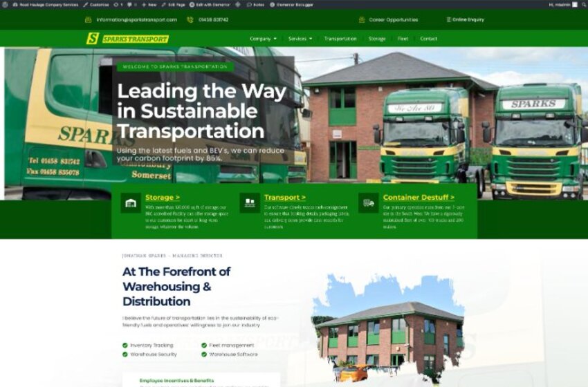
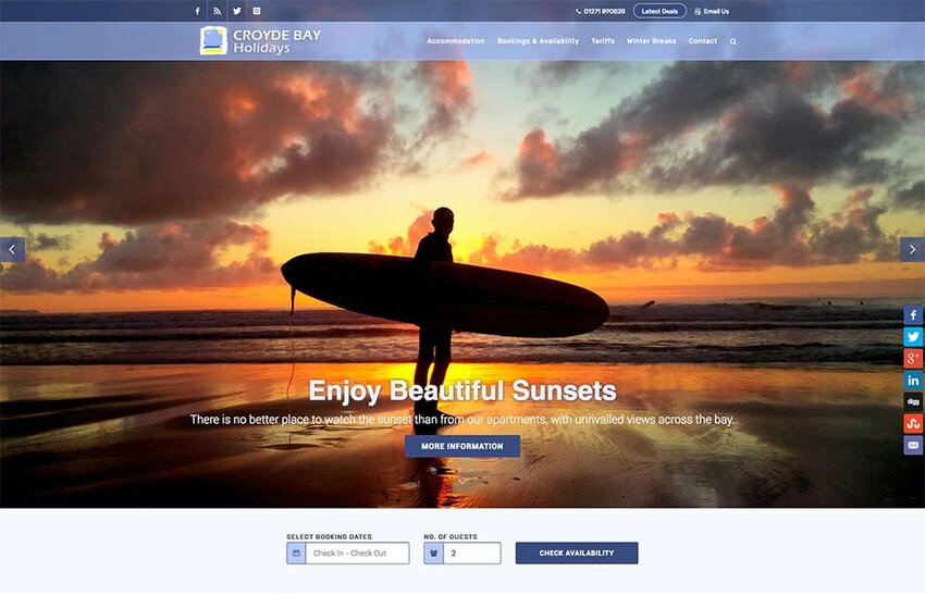
E-Commerce Website Design Bristol
We design and build bespoke e-commerce websites that turn browsers into buyers. Custom-built, mobile-first, and engineered to convert at every stage of the customer journey.
Your Online Store Is Losing Sales
Over 70% of online shopping carts are abandoned before checkout. Slow load times, poor mobile experiences, and weak trust signals are costing UK businesses millions every year.
Abandoned Carts
Complex checkouts, forced account creation, and confusing layouts cause 70% of shoppers to abandon before they buy. We fix every friction point.
Not Mobile-Ready
Over 60% of online shopping happens on mobile. A broken mobile store is not just a design problem — it is lost revenue every single day.
Trust Issues
No visible reviews, poor product imagery, and generic design make visitors question your legitimacy. Trust is built before the buy button is ever clicked.
Slow Product Pages
Every extra second of load time costs 7% in conversions. Slow stores lose sales to faster competitors — and customers rarely come back.
Online Stores Built to Convert
Every e-commerce store we build is custom-coded, mobile-first, and designed to maximise conversions at every step — from browse to basket to checkout.
Product Catalogues
Beautiful product listings with smart filtering, sorting, and search. Every catalogue is designed to make products easy to find and impossible to resist.
Checkout & Payments
Frictionless checkout flows with Stripe, PayPal, Apple Pay, and Klarna. One-page checkout, guest checkout, and saved payment methods built in.
Inventory Management
Real-time stock management, low-stock alerts, and automated sold-out handling. Your catalogue always reflects your actual inventory.
Sales Dashboard
Live sales analytics, conversion tracking, and revenue dashboards. Know exactly which products are performing and where customers are dropping off.
Product SEO
Schema markup, structured product data, and keyword-optimised descriptions. Every product page built to rank and drive organic traffic from Google.
Mobile Shopping
Touch-optimised galleries, swipe-friendly carousels, and fast-loading mobile checkout. Built for the 60% of shoppers browsing on their phone.
From Brief to Launch in Four Steps
Discovery
We audit your current store, understand your products, and map the full customer journey. Every friction point is identified before we write a single line of code.
Design
Custom UI designed around your products and customers. Every screen — from product listing to checkout confirmation — is designed for maximum conversion.
Build & Test
Bespoke code with real payment integrations, tested across 20+ devices and browsers. Your store launches only when every feature works perfectly.
Launch & Support
We deploy, monitor performance, and provide ongoing support. As your product range grows, your store scales with it.
"approach": "Mobile-First",
"breakpoints": [
"375px",
"768px",
"1024px",
"1440px"
],
"framework": "Next.js 14",
"css": "Custom + Tailwind",
"testing": "20+ Devices",
"performance": "Sub-3s Target"
}
Recent Responsive Projects

E-Commerce Design FAQs
Let's Build Something
That Actually Works.
Book a free consultation. We will review your current setup, identify quick wins, and give you a clear proposal with fixed pricing. No obligation.