
Optimize your website for tablet and mobile devices
Mediatopia is a leading mobile web design company with over 200 mobile-friendly projects built in the last few years. All of our sites work on internet-enabled smartphones and tablet devices.
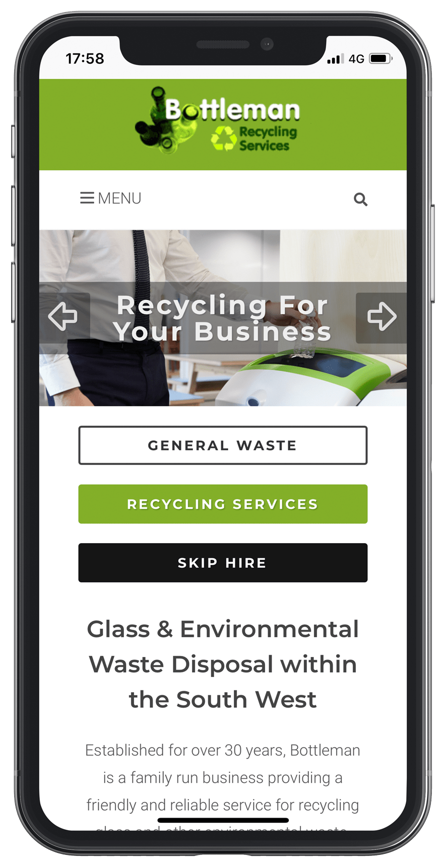
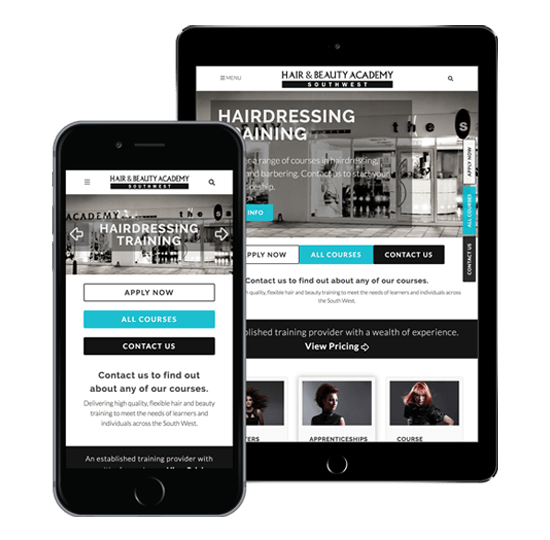
A mobile design differs from a responsive website; mobile sites are designed specifically for mobile telephones and look similar to a web application.
At Mediatopia, we specialise in mobile web development and designing smartphone sites so we can be more creative with the look and feel of the mobile design.
Mediatopia has the knowledge and experience of designing and developing websites for mobile and tablet devices.
We were one of the first web design companies in the U.K to start implementing mobile and tablet commercial websites from as early as 2010.
Mobile-First Design
M-Commerce
Mobile development
With billions of searches being performed daily on Google by digital phones and tablets, a mobile web design is the next logical step for your business.
jQuery Framework
Mobile-Friendly Site Design
Bespoke Landing Pages
Social Media Integration
Enhanced Page Speed
Mobile-First Index

Do you have a project that you would like to discuss? Call us on 0117 332 6021
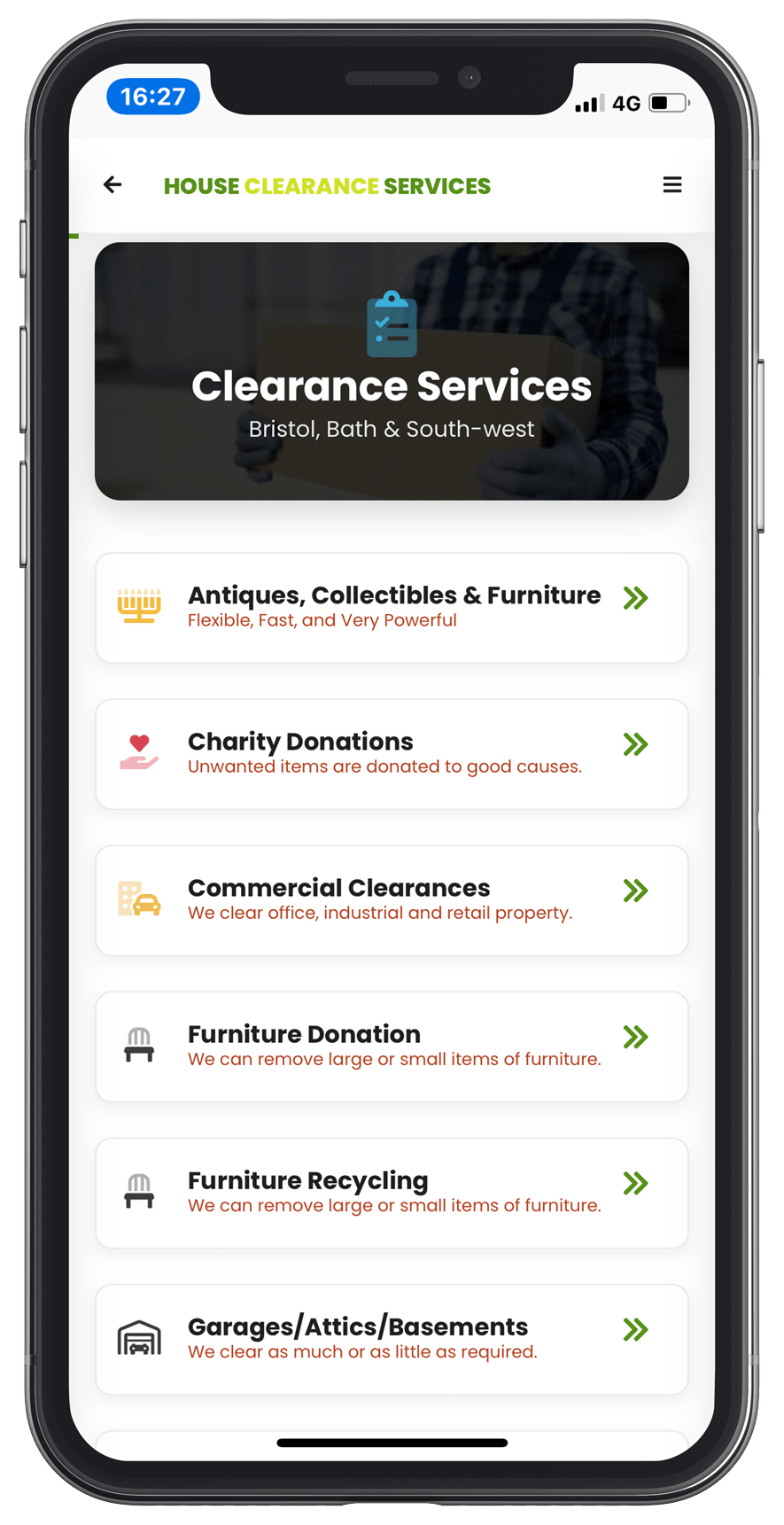
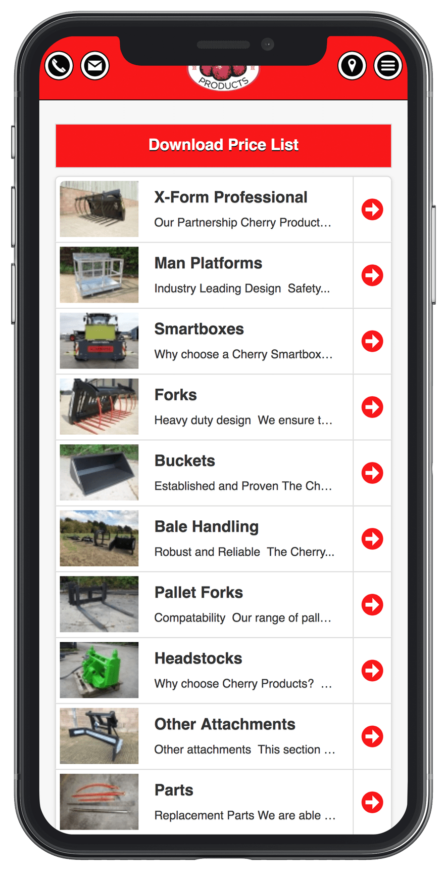
We build our mobile sites as a stand-alone product; you will need an existing desktop website. We design each of our mobile sites around the content of your current website. We use optimal space on the screen to create a much better user experience allowing web traffic to drill down to specific user-enabled content, allowing for faster browsing and signing up for your services or products via cleverly designed landing pages. Please take a look at our professional packages below.
The faster the website, the better the ranking on Google!
£100/month
£200 initial set-up fee
£200/month
£200 initial set-up fee
£1500/from
You own website copyright
£1995/from
You own website copyright
Monthly Rental
All our monthly rental websites have a 12-month minimum contract agreement
We host on our dedicated server, monitoring and supporting whilst you run your business.
With our starter & pro mobile sites you can send in your content changes every 3 months.
If you take ownership of a mobile site then you can update your content using File Transfer Protocal (FTP) we will set this up for you and give you initial training.
Website Ownership
Once the website has been built, we will transfer all the files to you to set up on your own hosting.
We build your website on an open source platform. You can then host the website wherever you want.
All the images and written content on the website will become your property.
We offer our support and assistance should you need it in the future.
Answers to the questions people always ask!
Mobile-friendly means a website designed specifically for a handheld smartphone device. When that device views a web page, it will fit the screen and can be read and interacted with simplistically. Both responsive sites and sites built using a mobile framework work like this. The only difference is their appearance on the screen.
Because 80% of people who browse for products and services online use a phone/tablet device, if your site isn’t mobile-friendly, it will not work in an optimised manner. The text is too tiny to read web forms are too fiddly to fill out. Mobile websites get ranked on Google’s mobile index and are easily found online through custom keyword research.
It knows how to design a site specifically for mobile devices—using all the different HTML 5 elements and touch-enabled features to craft a fast-loading web application. Pages get built using a wireframe which allows for creating a bespoke user experience for the end-user. Please take a look at some of our mobile web design case studies.
You need to check to see if it is mobile-friendly. Go to Google’s mobile-friendly page test and type in your web address, the result of the scan will tell you if your site is or isn’t.
Optimise content for smaller screens. Make the call to action visible. Use WebP, lossy or lazy-load images to accelerate page speed. Give tap targets space on the screen. Choose an easy-to-read font. Keep textual content precise and to the point. Use HTML interactive features to enhance the (UX).
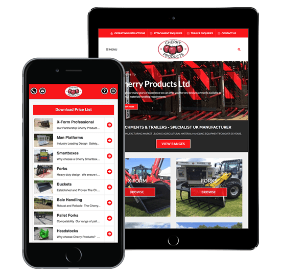
Creating a mobile plan is a better method. It is more costly than a responsive site, but it explains services and products better. Most responsive websites show mobile content in a large format with exceedingly long scrolling pages, and displayed information is nonsensical. Mobile design allows for granular control over pages’ look, feel and interactivity.