Product Page Design Bristol
We design high-converting product pages that showcase your products at their best. Rich imagery, compelling copy, and smart layouts that make adding to cart feel obvious.
Your Product Pages Aren't Converting
The average product page converts less than 3% of visitors. Poor imagery, weak descriptions, and confusing layouts mean most visitors leave without buying — even when they want your product.
Poor Product Images
Low-resolution or missing product images are the number-one reason visitors abandon product pages. Great visuals are not optional — they are the sale.
Hard to Find Products
Poor search, confusing navigation, and no smart filtering mean customers cannot find what they want. If they cannot find it, they cannot buy it.
Weak Descriptions
Generic copy, missing specifications, and no storytelling give customers no reason to choose you over a competitor. Words and detail sell online.
Broken on Mobile
Product pages that are hard to use on mobile — tiny images, difficult-to-tap buttons, slow galleries — lose the majority of their potential customers.
Product Pages That Sell
Every product page we build is engineered to convert. Rich galleries, smart filtering, structured data, and conversion-focused layouts that sell for you 24/7.
Product Galleries
Zoomable high-resolution images, 360° views, and video integration. Give customers the confidence to buy by showing every detail of your product.
Smart Filtering
Category filtering, attribute-based search, and faceted navigation. Customers find exactly what they want in seconds — not minutes.
Reviews & Ratings
Star ratings, verified reviews, and trust badges woven into every product page. The credibility that converts browsers into buyers.
Size Guides & Specs
Benefit-led copy, feature tables, and size guides. Every description structured to answer every customer question before it is asked.
Dynamic Pricing
Schema markup for products, reviews, and availability. Rich snippets in search results that drive higher click-through rates from Google.
Mobile Product UX
Touch-optimised galleries, swipe navigation, and mobile checkout flows. Designed for the 60% of product browsing that happens on phones.
From Brief to Launch in Four Steps
Discovery
We research your products, customers, and competitors. Every product page is designed around what converts for your specific audience and market.
Design
Custom layouts with clear hierarchy, conversion-focused CTAs, and gallery structures designed to showcase your products at their absolute best.
Build & Test
Bespoke code with real product data, tested across 20+ devices and browsers. Performance-optimised so pages load fast on every connection.
Launch & Support
We deploy your new product pages, monitor conversions, and iterate. As your range grows, your pages evolve with it.
"approach": "Mobile-First",
"breakpoints": [
"375px",
"768px",
"1024px",
"1440px"
],
"framework": "Next.js 14",
"css": "Custom + Tailwind",
"testing": "20+ Devices",
"performance": "Sub-3s Target"
}
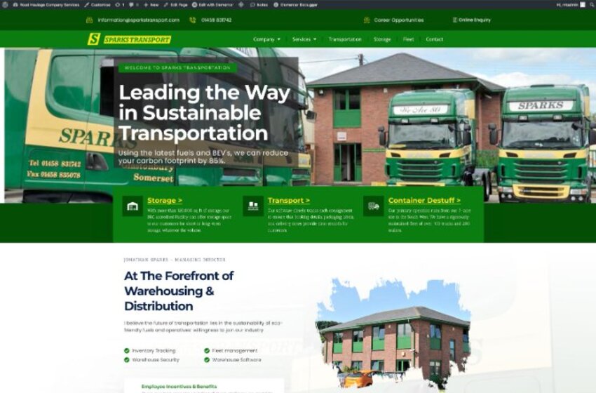
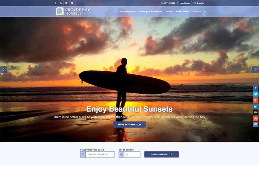
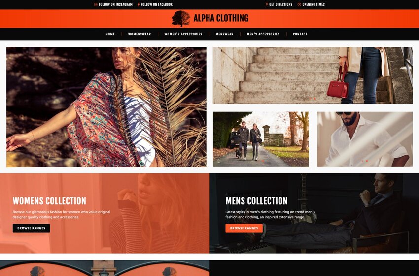
Recent Responsive Projects
Product Page FAQs
Let's Build Something
That Actually Works.
Book a free consultation. We will review your current setup, identify quick wins, and give you a clear proposal with fixed pricing. No obligation.