Digital Consulting Bristol
Twenty-two years of building digital products gives us a perspective most consultants don't have. We've seen what works, what fails, and what wastes money. We'll tell you honestly which is which.
Most Digital Advice Is Expensive and Wrong.
Agencies push platforms they know. Freelancers recommend what they can build. Large consultancies tell you what you want to hear. We tell you what's actually right for your business — even if that means recommending something simpler.
Wasted Budget
Businesses spend thousands on the wrong platform, the wrong agency, or the wrong strategy. A two-hour consultation can save months of wasted time and money.
Too Many Options
WordPress, Shopify, headless CMS, bespoke build — the choices are overwhelming. We cut through the noise and tell you exactly what you need.
No Clear Strategy
Most businesses have a website but no digital strategy. No content plan, no SEO foundation, no idea what's working. We fix that.
Technical Debt
Years of quick fixes, plugin bloat, and outdated code slow your site and create security risks. We audit and create a clear plan to fix it.
Digital Consulting Bristol — What We Do
Honest, independent digital advice from people who have built over 3,000 digital products. No bias, no agenda — just the right answer for your business.
Digital Strategy
A clear roadmap for your digital presence — what to build, in what order, with what budget. Grounded in your business goals, not technology trends.
Website & Platform Audits
A full technical, SEO, and UX audit of your existing website. We tell you exactly what's wrong, why it matters, and how to fix it — in plain English.
Platform Selection
WordPress, Shopify, Magento, headless, bespoke — we help you choose the right platform for your requirements without any bias towards what we can build.
Agency Procurement
Helping you write briefs, evaluate proposals, and choose the right agency for your project. We know what good looks like and what red flags to avoid.
AI & Automation Strategy
Where AI can genuinely help your business versus where it's hype. We identify practical automation opportunities that save time and reduce costs.
Vendor Reviews
Reviewing existing agency relationships, hosting arrangements, and software contracts — identifying where you're overpaying or underserved.
How Our Consulting Service Works
Discovery Call
A free 30-minute call to understand your situation and whether consulting is the right fit. No obligation.
Deep Dive Session
A structured 2-hour session — in person in Bristol or via video call — covering your current digital setup, challenges, and goals.
Report & Recommendations
A written report with prioritised recommendations, technology suggestions, and a clear action plan. Delivered within 5 working days.
Ongoing Support
Optional monthly retainer for ongoing strategic advice — useful during agency selection, platform migrations, or digital transformation projects.
"approach": "Platform Agnostic",
"services": [
"Digital Strategy",
"Platform Audit",
"Agency Review",
"AI Strategy"
],
"first_call": "Free",
"report": "Included",
"agenda": "None",
"experience": "22 Years"
}
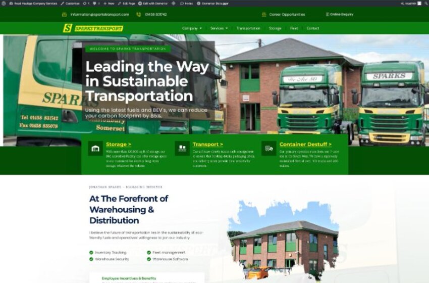
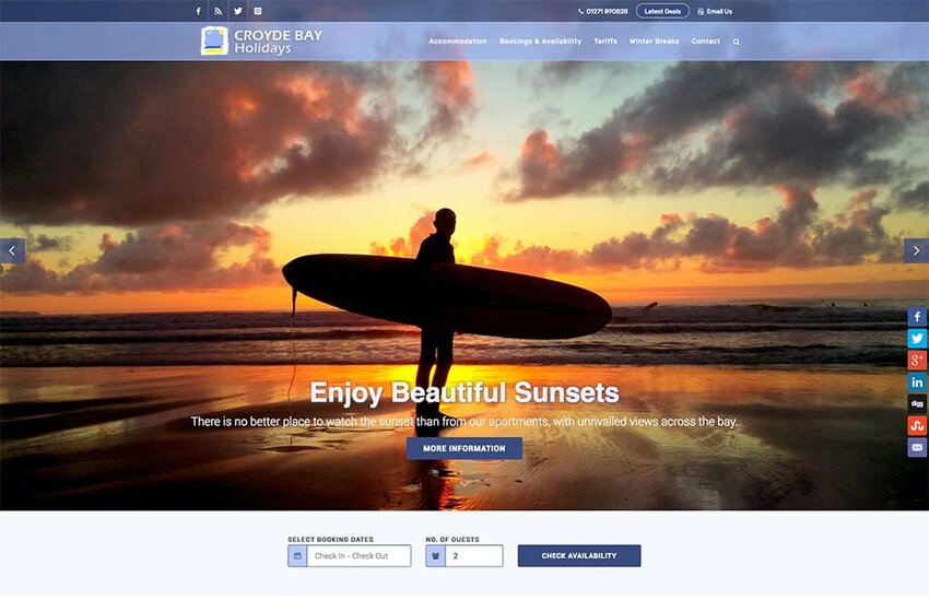
Recent Responsive Projects

Digital Consulting FAQs
Start Your
Free Consultation.
No obligation. No hard sell. Just an honest conversation about what's right for your business.